


As part of our wider creative partnership with Nectere, we were commissioned to develop the branding and packaging design for Java Xpress — a premium coffee brand created to offer quality, convenience, and visual impact in the competitive beverage market. The brief was to create packaging that would stand out on shelves, communicate flavour distinctions clearly, and reinforce a sense of quality aligned with Nectere’s professional brand standards.
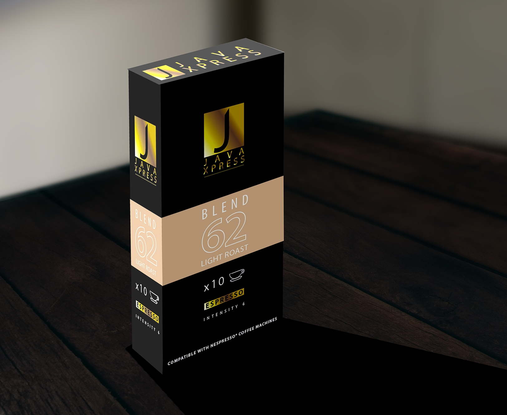
Java Xpress needed a bold, modern identity that could appeal to both individual customers and businesses sourcing coffee for offices or retail. We developed a striking visual style centred around a strong monogram logo in gold and black — colours chosen to evoke sophistication and premium quality. The name “Java Xpress” is presented in a clean, contemporary typeface, reinforcing clarity and recognition across all product lines.
We designed a cohesive range of packaging for different blends, each featuring a distinct accent colour to differentiate roast types and flavour intensities. From the warm gold of the medium roast to the earthy brown of the dark roast and the soft beige of the light roast, each variant maintains visual harmony while remaining instantly recognisable. Essential information such as blend number, roast type, and espresso intensity is clearly displayed on the front panel, ensuring the product is as practical as it is visually appealing.
The artwork was created with both aesthetic and functional considerations in mind. Bold typography ensures legibility, while the colour-block design helps with quick product selection. We also incorporated subtle metallic effects within the logo for added shelf presence, reflecting light and drawing the eye. The consistent application of the design across upright boxes and flat packs ensures a seamless brand experience regardless of product format.
The final result is a packaging suite that not only enhances Java Xpress’s visibility but also reinforces its positioning as a quality, trustworthy coffee brand. The clean, professional look sits comfortably within both retail and corporate environments, while the colour-coded system makes the range easy to navigate for repeat customers.
This project demonstrates how effective brand identity design, combined with thoughtful packaging artwork, can elevate a product’s presence and strengthen recognition in a competitive marketplace.
| Cookie | Duration | Description |
|---|---|---|
| cookielawinfo-checkbox-analytics | 11 months | This cookie is set by GDPR Cookie Consent plugin. The cookie is used to store the user consent for the cookies in the category "Analytics". |
| cookielawinfo-checkbox-functional | 11 months | The cookie is set by GDPR cookie consent to record the user consent for the cookies in the category "Functional". |
| cookielawinfo-checkbox-necessary | 11 months | This cookie is set by GDPR Cookie Consent plugin. The cookies is used to store the user consent for the cookies in the category "Necessary". |
| cookielawinfo-checkbox-others | 11 months | This cookie is set by GDPR Cookie Consent plugin. The cookie is used to store the user consent for the cookies in the category "Other. |
| cookielawinfo-checkbox-performance | 11 months | This cookie is set by GDPR Cookie Consent plugin. The cookie is used to store the user consent for the cookies in the category "Performance". |
| viewed_cookie_policy | 11 months | The cookie is set by the GDPR Cookie Consent plugin and is used to store whether or not user has consented to the use of cookies. It does not store any personal data. |